Note
Click here to download the full example code
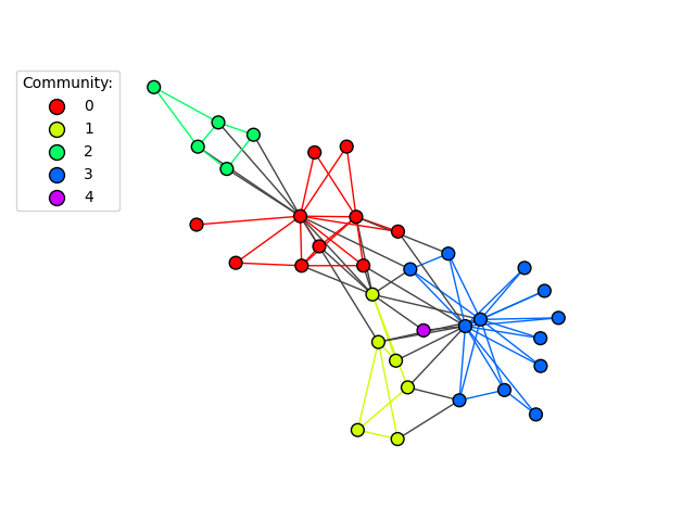
Communities
This example shows how to visualize communities or clusters of a graph.
import igraph as ig
import matplotlib.pyplot as plt
First, we generate a graph. We use a famous graph here for simplicity:
g = ig.Graph.Famous("Zachary")
Edge betweenness is a standard way to detect communities. We then covert into
a igraph.VertexClustering object for subsequent ease of use:
communities = g.community_edge_betweenness()
communities = communities.as_clustering()
Next, we color each vertex and edge based on its community membership:
num_communities = len(communities)
palette = ig.RainbowPalette(n=num_communities)
for i, community in enumerate(communities):
    g.vs[community]["color"] = i
    community_edges = g.es.select(_within=community)
    community_edges["color"] = i
Last, we plot the graph. We use a fancy technique called proxy artists to make a legend. You can find more about that in matplotlib’s Legend guide:
fig, ax = plt.subplots()
ig.plot(
    communities,
    palette=palette,
    edge_width=1,
    target=ax,
    vertex_size=0.3,
)

# Create a custom color legend
legend_handles = []
for i in range(num_communities):
    handle = ax.scatter(
        [], [],
        s=100,
        facecolor=palette.get(i),
        edgecolor="k",
        label=i,
    )
    legend_handles.append(handle)
ax.legend(
    handles=legend_handles,
    title='Community:',
    bbox_to_anchor=(0, 1.0),
    bbox_transform=ax.transAxes,
)
plt.show()
For an example on how to generate the cluster graph from a vertex cluster, check out Generating Cluster Graphs.
Total running time of the script: ( 0 minutes 0.273 seconds)